Exentrica: The One That Nearly Got Away!
G-Type’s Nick Cooke tells the story of ‘losing’ a typeface and how he painstakingly re-assembled his latest release from previous social media posts!
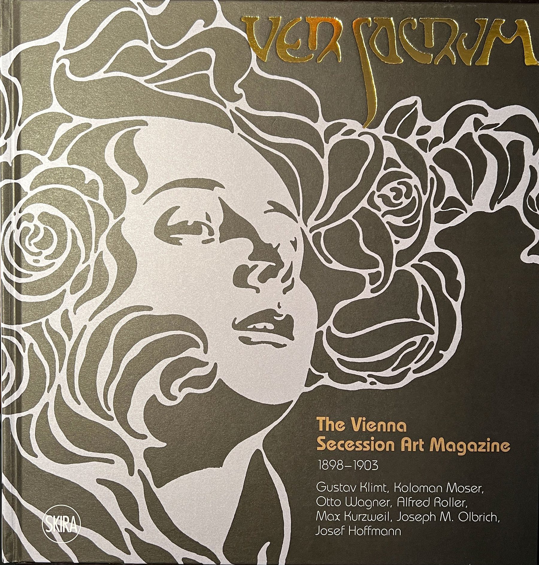
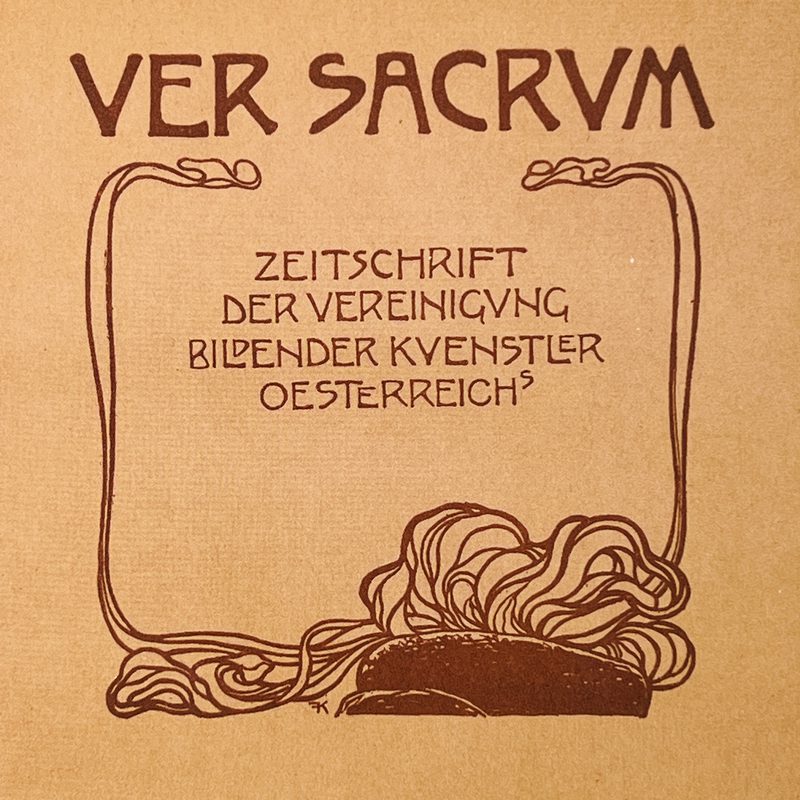
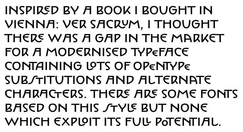
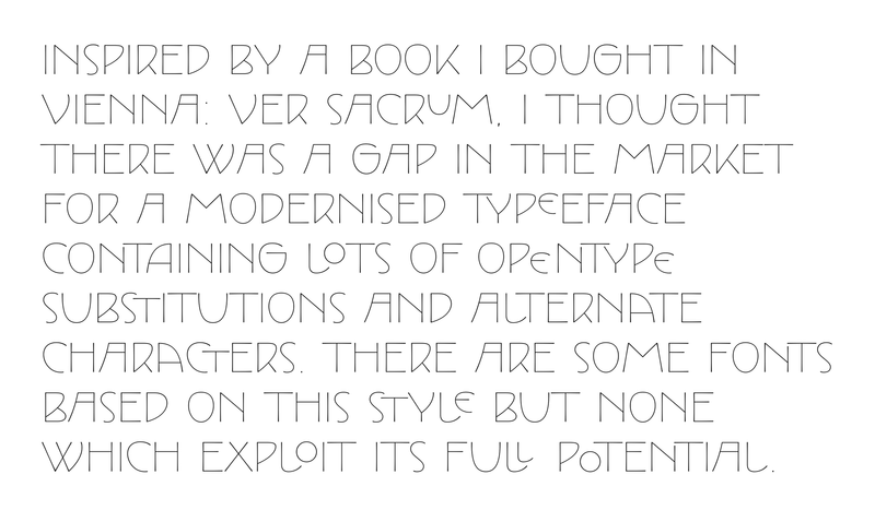
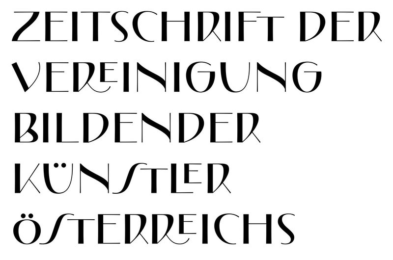
“During a visit to the MAK: Museum für angewandte Kunst, (Museum of Applied Arts) in Vienna I couldn’t help but be impressed with the work of the Viennese Secession artists Kolomon Moser, Josef Hoffmann, Gustav Klimt and Josef Maria Olbrich from 1898 to 1903. I was particularly drawn to the style of lettering by these artists who adopted a similar aesthetic, although not the same as each other.
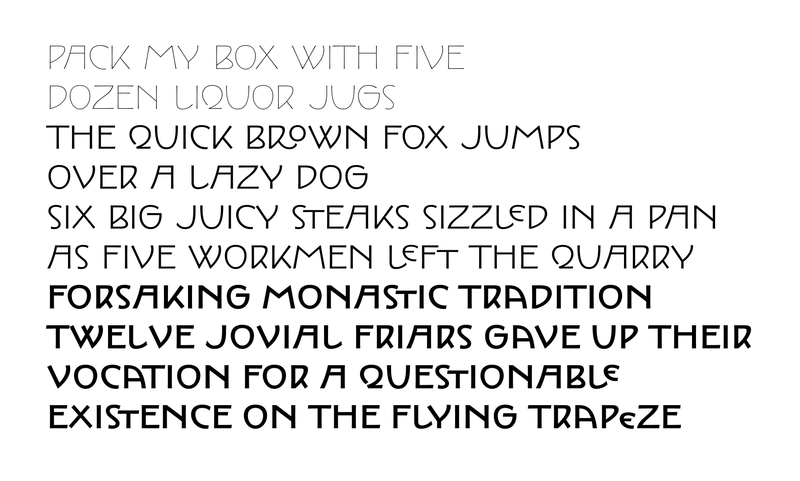
I bought the Ver Sacrum book and studied the lettering throughout. An idea began to form; I could distil the overall style into one typeface with many different variations via the use of style sets which could all be interchangeable to give a huge typographic variety. I further expanded this idea by incorporating two distinctly different styles of type: Monoline and Contrast.
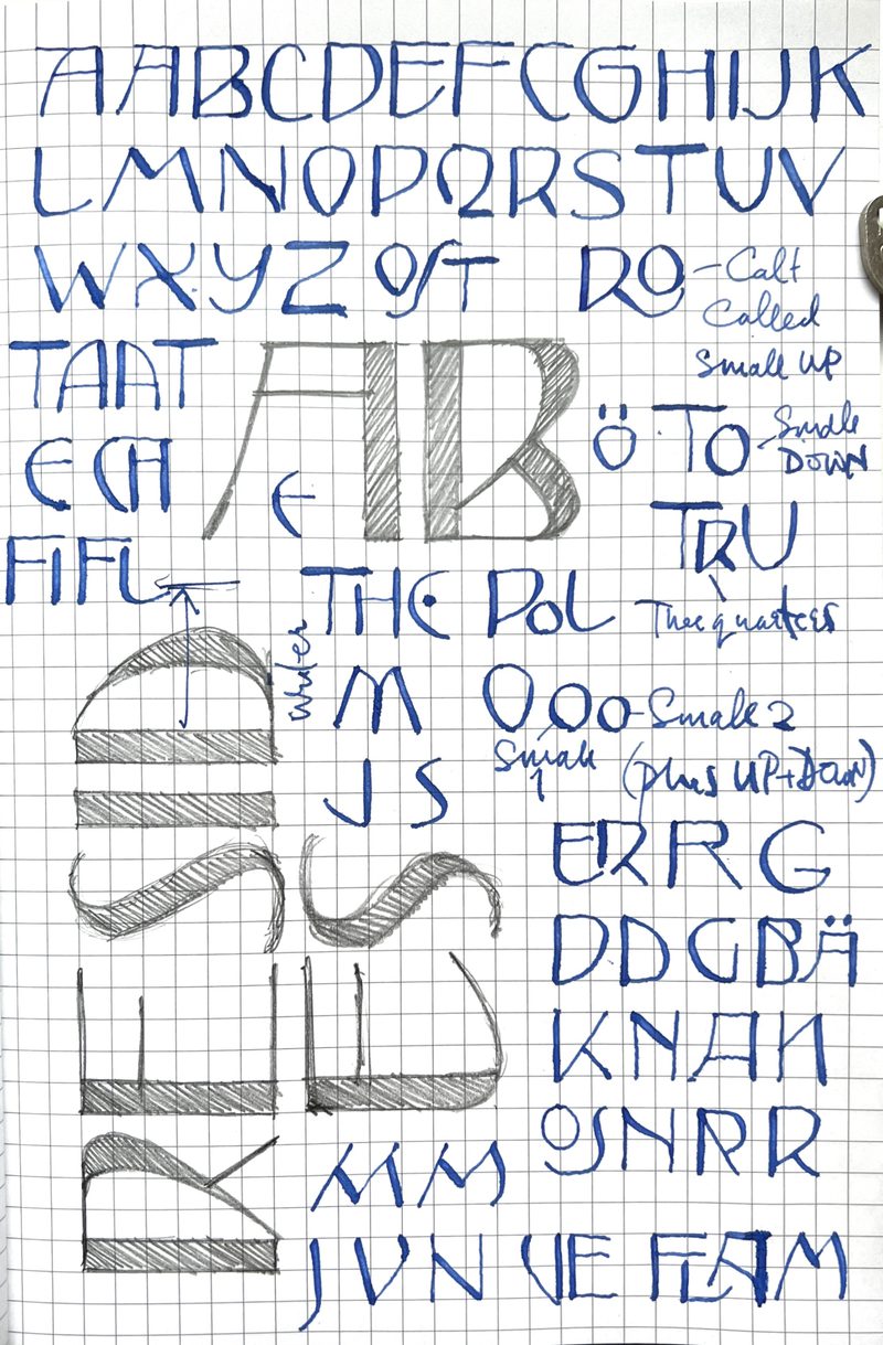
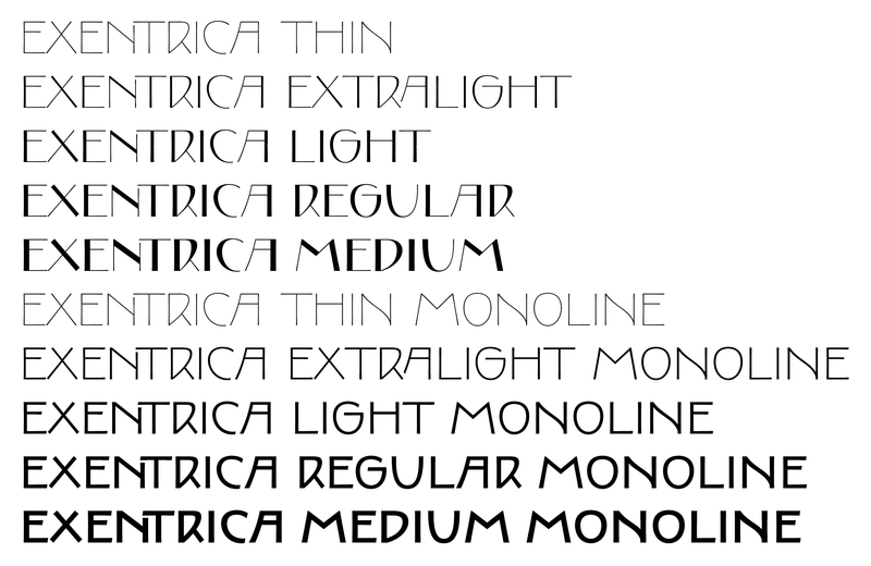
I did an initial sketch identifying different versions of the same letter and ligated combinations, of which there were quite a few. I established the style for the Monoline and Contrast variants fairly quickly and then developed the weight range in each, going from Thin to Medium via three intermediate weights. I was pleased with the results so I posted them on Twitter on January the 11th. I posted more images on Twitter and LinkedIn throughout January. It was progressing really well. I worked the whole of January solely on this new typeface which I now called Exentrica.
At the beginning of February… Hold on, what’s this? My machine isn’t booting up. The progress bar stalls halfway. I try various troubleshooting methods gleaned from the internet, but it just refuses to start. So I take my Mac to a specialist repairers but they are unable to retrieve anything. Thankfully I had my external hard drive which automatically backs up via Time Machine.
Phew! What a relief!
But! It hadn’t backed up since 17th of December, and I hadn’t noticed because I naturally assumed that Apple products are so reliable and I had never had any problems in all the long years of using them.
So all was lost. An entire month of work on one typeface. Bugger!
I was pretty annoyed, but thought it could have been worse; I might have lost everything. So I downloaded all the images I had posted on social media and started again. I remembered everything I had done, and was able to recreate the whole font virtually identical to the original.
I worked on the various features using mainly contextual alternates to produce ligated pairs and other style sets. After careful consideration I arrived at seven style sets:
SS1: Up and Down
SS2: Curvy bottoms E, L
SS3: Long stretched S
SS4: Alternate Curved E
SS5: Alternate M, N, V, W, Y, Z
SS6: Fancy ampersand
SS7: Round topped M
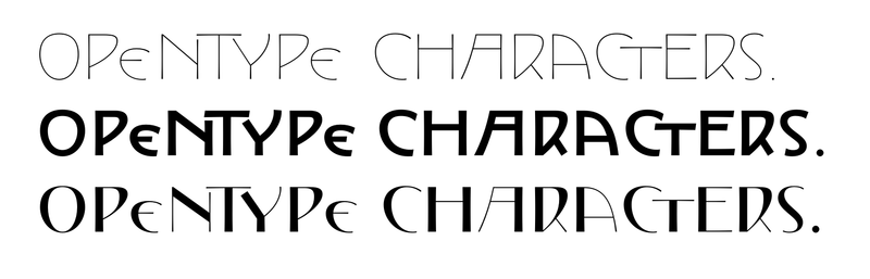
All style sets work with each other, giving endless combinations of typographic experimentation using OpenType. I also created a variable font, incorporating all styles and weights in one interactive font.”
Exentrica is now available to licence on the master font page:
https://g-type.com/fonts/exent...