
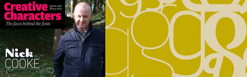
Nick Cooke Q&A
G-Type founder Nick Cooke was interviewed by Jan Middendorp in March for the MyFonts Creative Characters Newsletter which is issued to over 1 million subscribers.
Nick responded to questions about his early career and typographic inspiration in typically irreverent style. He also shed a little light on his working methods when creating custom fonts for high profile clients and the typical dialogue that ensues.
This is how Jan Middendorp introduced Nick to the MyFonts readership:
“The range of his work is stunning: from the corporate-yet-friendly logo for London’s Oyster card to exuberant script lettering and powerful handwriting fonts. His best sellers are versatile sans-serifs such as Houschka and Chevin, the latter of which is ubiquitous in the UK as Royal Mail’s corporate typeface. A recent series of sweeping updates has catapulted several of his fonts back onto our Hot New Fonts list. He has a soft spot for the letter ‘g’ — hence the name of his foundry, G-Type. From book covers dripping in blood to the most realistic script face on the market — here is the Nick Cooke story, told in his own words.”
Read more about cow gum, the origins of the G-Type moniker & Nick’s typographic principles on the MyFonts website.